
The Ichimoku Cloud, also known as Ichimoku Kinko Hyo, is a versatile indicator that defines support and resistance, identifies trend direction, gauges momentum and provides trading signals. Ichimoku Kinko Hyo translates into "one look equilibrium chart". With one look, chartists can identify the trend and look for potential signals within that trend. The indicator was developed by Goichi Hosada, a journalist, and published in his 1969 book. Even though the Ichimoku Cloud may seem complicated when viewed on the price chart, it is really a straight forward indicator that is very usable. It was, after all, created by a journalist, not a rocket scientist! Moreover, the concepts are easy to understand and the signals are well-defined.
The Cloud (Kumo) is the most prominent feature of the Ichimoku Cloud plots. The Leading Span A (green) and Leading Span B (red) form the Cloud. The Leading Span A is the average of the Conversion Line and the Base Line. Because the Conversion Line and Base Line are calculated with 9 and 26 periods, respectively, the green Cloud boundary moves faster than the red Cloud boundary, which is the average of the 52-day high and the 52-day low. It is the same principle with moving averages. Shorter moving averages are more sensitive and faster than longer moving averages.
There are two ways to identify the overall trend using the Cloud. First, the trend is up when prices are above the Cloud, down when prices are below the Cloud and flat when prices are in the Cloud. Second, the uptrend is strengthened when the Leading Span A (green cloud line) is rising and above the Leading Span B (red cloud line). This situation produces a green Cloud. Conversely, a downtrend is reinforced when the Leading Span A (green cloud line) is falling and below the Leading Span B (red cloud line). This situation produces a red Cloud. Because the Cloud is shifted forward 26 days, it also provides a glimpse of future support or resistance.
Chart 2 shows IBM with a focus on the uptrend and the Cloud. First, notice that IBM was in an uptrend from June to January as it traded above the Cloud. Second, notice how the Cloud offered support in July, early October and early November. Third, notice how the Cloud provides a glimpse of future resistance. Remember, the entire Cloud is shifted forward 26 days. This means it is plotted 26 days ahead of the last price point to indicate future support or resistance.
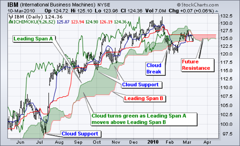
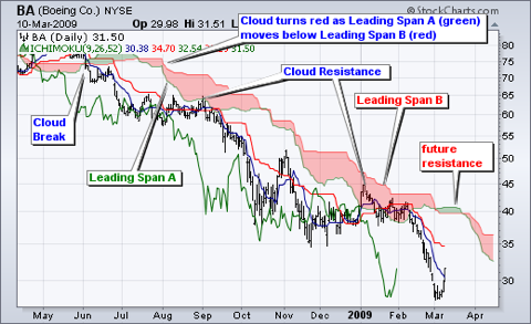
Chart 3 shows Boeing (BA) with a focus on the downtrend and the cloud. The trend changed when Boeing broke below Cloud support in June. The Cloud changed from green to red when the Leading Span A (green) moved below the Leading Span B (red) in July. The cloud break represented the first trend change signal, while the color change represented the second trend change signal. Notice how the Cloud then acted as resistance in August and January.
Price, the Conversion Line and the Base Line are used to identify faster, and more frequent, signals. It is important to remember that bullish signals are reinforced when prices are above the cloud and the cloud is green. Bearish signals are reinforced when prices are below the cloud and the cloud is red. In other words, bullish signals are preferred when the bigger trend is up (prices above green cloud), while bearish signals are preferred when the bigger trend is down (prices are below red cloud). This is the essence of trading in the direction of the bigger trend. Signals that are counter to the existing trend are deemed weaker. Short-term bullish signals within a long-term downtrend trend and short-term bearish signals within a long-term uptrend are less robust.