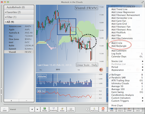
You can draw circles and rectangles on the chart, about the same way you draw a line
Either use the Lines menu, or right click on the graph, and select Circle or Rectangle.
A circle/rectangle is defined by its diagonal. Just click to define the two extremes point.
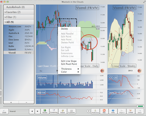
Once a circle or rectangle is defined, right-clicking on it displays a context menu similar to the ones used for lines.